
Earthy
Earthy is a luxury wellness brand transforming hydration through state-of-the-art purification and effortless usability. Its aim is to provide a new-age machine — one that achieves pure, healthy hydration through innovative, convenient, and sustainable water purification solutions.
Project Overview
Project Details
Electronics & Technology
Industry
Bangalore
Location
2024-25
Year
Parentheses Studio
Team
Lead Designer
Role
Branding
Strategic Thinking
Work
Web Design


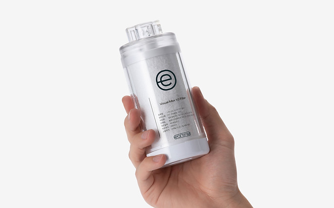
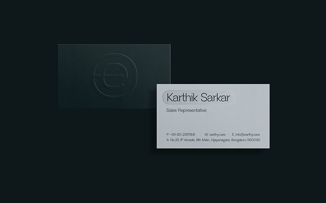
The Earthy logo is anchored by a lowercase 'e' enclosed within a circle, subtly evoking a power button—a nod to the effortless simplicity of turning on clean water. The wordmark extends from this central logomark, reinforcing the brand's minimal, efficient design.
The logo not only serves as a symbol but also integrates into the purifier's user interface, open up possibilities of indicating various states.


Earthy introduces three types of purifiers — Under-the-Counter, Built-In, and Counter-Top — all designed as next-generation solutions that go beyond simply providing clean water.


Earthy’s brand font strikes a balance between curvy flares and a clean structure. Its thin, tightly set letters hint at the brand’s futuristic edge. The gentle curve of the logo mark adds a natural touch — a flowing line that extends into the broader visual language, complementing the refined typography with a sense of effortless movement.

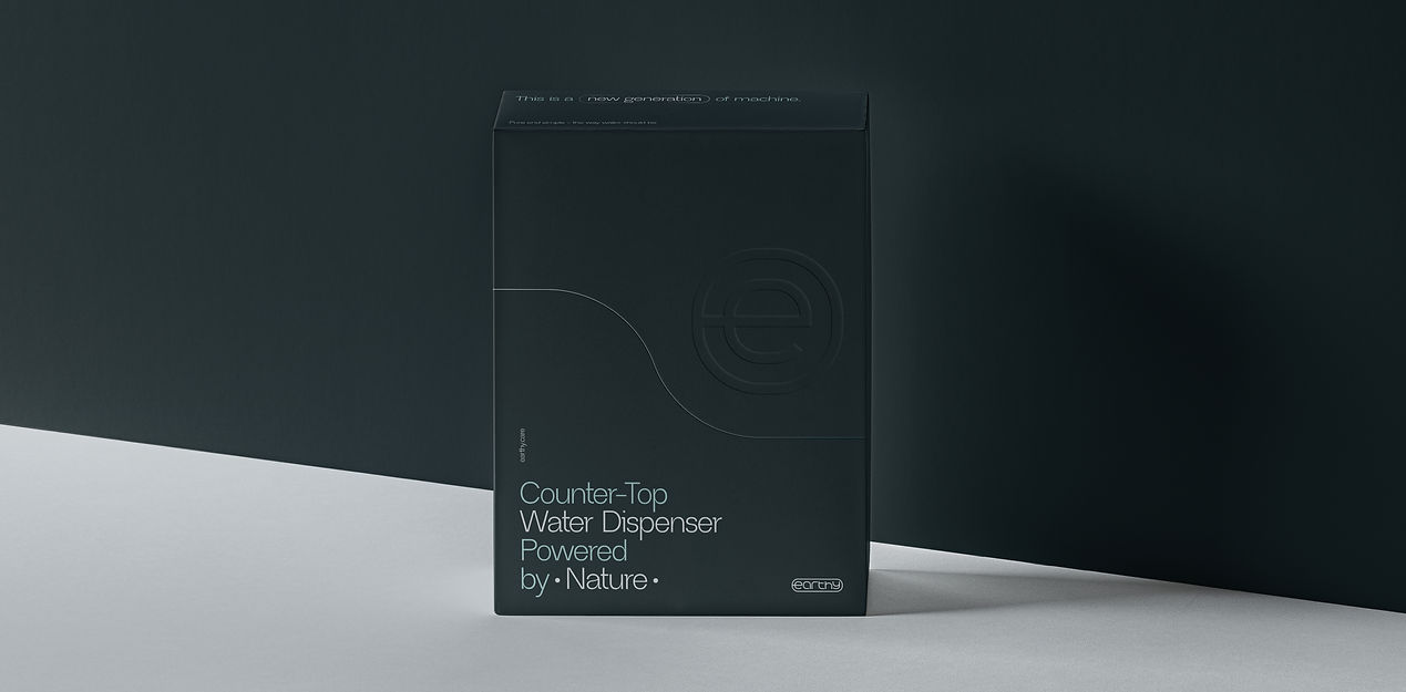
Some packaging concepts for Earthy explored multi-layered structures, featuring the signature ‘e’ as a cut-out window. This allowed the brand’s teal color to shine through from a secondary layer beneath, adding depth, intrigue, and a distinct brand reveal.

Another concept borrowed Earthy’s squircle logomark and reimagined it as a window revealing a technical, detailed sketch of the purifier — reinforcing its futuristic appeal. In both concepts, the signature flowing line was beautifully integrated as a visual break between the top and bottom parts of the box, allowing Earthy’s distinctive teal blue to show through and creating a unique, layered unboxing experience.


Web design
Figma prototyping


