
Publication Design
Web Design
Poetry of Earth
Poetry of Earth is a real estate project in Varthur, Bangalore, designed for those who cherish life’s quiet poetry. Its branding and publication is crafted to capture this serene spirit — elegant, nature-inspired illustrations and refined typography echoing lush landscapes and tranquil living. The identity invites potential residents to rediscover peace and fall in love with life’s gentle moments, seamlessly blending sophistication with the raw beauty of nature.
Project Overview
Project Details
Real Estate
Industry
Bangalore
Location
2024-25
Year
Parentheses Studio
Team
Lead Designer
Role
Work
Print Execution


The whimsy of Poetry of Earth comes alive through its carefully crafted vector illustrations. Designed to echo the abundant nature woven throughout the property, the illustrations balance relevance to the project’s unique features with a poetic lightness. I chose bright, optimistic tones that complement the brand’s primary green palette, adding vibrancy without overpowering its calm essence.
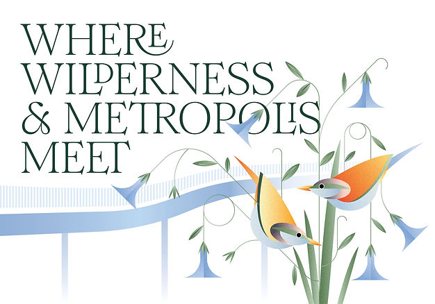


A classic serif typeface became the quiet hero of the publication design. Its graceful usage of glyphs and tight knit setting evoke the feeling of poetry on a page, while the illustrations weave through the type and bringing these section spreads together.
Each illustration combines clean geometric forms with organic elements, creating a subtle resemblance to natural growth and structure. Treated with bright gradients and a soft grainy texture, they bring a tactile warmth that extends beautifully into the printed pieces.


One of my biggest challenges — and triumphs — was executing a brochure that felt like an experience in itself. The section spreads demanded a treatment that did justice to the illustrations’ texture and whimsy. After many explorations, we settled on special finishes that make leafing through the pages a sensory delight.


Developing the cover was a story in itself — countless meetings with printers, experiments with finishes, and balancing budgets with ambition. The final design: a deep green cover adorned with delicate details brought to life through multi-level embossing and the beautifully crafted Poetry of Earth logo marking its presence with silver foiling. It’s a piece that invites touch, echoing the project’s promise of quiet luxury and a deep love for life’s gentle poetry.


The logo was crafted using the same elegant serif typeface, with customized glyphs that create a natural, flowing form. This subtle movement became the perfect base to weave in elements inspired by nature, tying the identity back to the project’s core idea of quiet, organic beauty.


