
Sunthings
Sunthings is a D2C FMCG brand offering a range of frozen goods — from fresh-cut fruits like coconut, banana, mango, and pineapple to convenient cooking staples like grated coconut, diced banana stem, banana blossom, and moringa leaves. Using advanced IQF (Individually Quick Frozen) technology, Sunthings ensures that every product retains its natural taste, texture, and nutrients, addressing the Indian consumer’s deep skepticism around packaged frozen foods.
Though I didn’t create the final branding, I explored visual directions and packaging ideas to help position Sunthings as a vibrant and trustworthy choice.
Project Overview
Project Details
FMCG
Industry
Goa
Location
2025
Year
Parentheses Studio
Team
Explorations
Role
Branding Concepts
Packaging Concepts
Work


Exploration 1
Concept one explored making the packaging instantly relatable by showing use case scenarios of each product. The front features a die-cut window shaped like its end use — for instance, a banana smoothie cup silhouette for banana chunks — paired with a quick recipe. This approach sparks curiosity, demonstrates product versatility right away, and helps remove doubts about usage, making the pack both engaging and informative at first glance.


Concept variants


Other
concepts
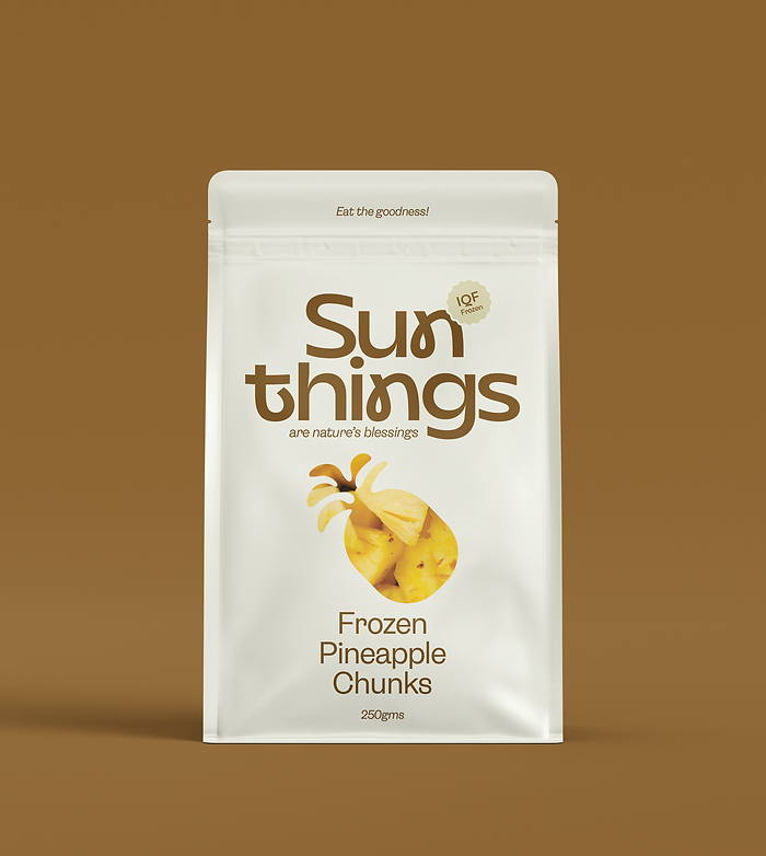


Concept Two centred on a friendly, approachable Sunthings logo as the focal point of the packaging, paired with playful copy that riffs on the brand name by hinting at “somethings.”


Built around fresh product imagery, this design feels inviting and familiar — aligning with the visual language of other imagery-heavy Indian shelf products while standing out through its distinctive typography and vibrant colours. The result is packaging that feels both trustworthy and eye-catching.